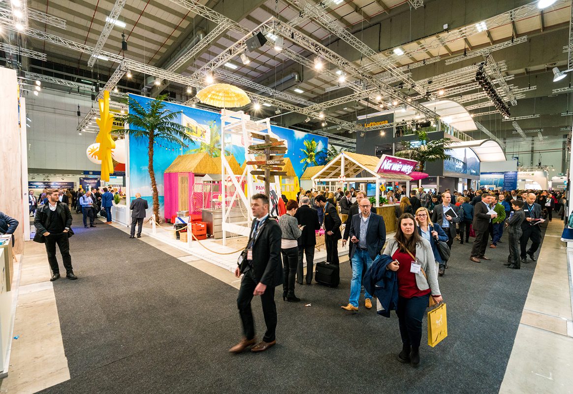
How often do attendees avoid walking down an aisle because it feels like an empty tunnel of doom? Bored salespeople on their phones and the overall sense of being bait are enough to make anyone turn on their heels and go for free coffee at a market leader’s sprawling exhibit.
But small can be beautiful and impactful. A 10×10 or a 10×20 booth, when designed with strategic intent, can offer an intimate and personalized experience that larger setups might miss. It can also be a creative space to try something new and bold.
Here are just a few small but mighty modest booths from brands that scored high on our engagement scale.
Hippeas
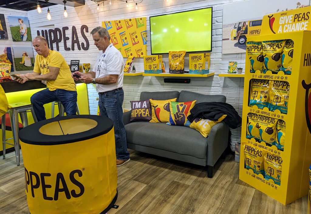
Hippeas lifted spirits with its bright and happy space playing off of the sunny yellows in the snack’s packaging and incorporating it the wall art, counter lighting and even the edges of the shelving. Faux wall finishes, cozy lighting and furniture as well as woodgrain floor set the relaxed mood and created a perfect setting for pops of color. Custom brand pillows and a giant snack dispenser added standout touches.
H-Bake
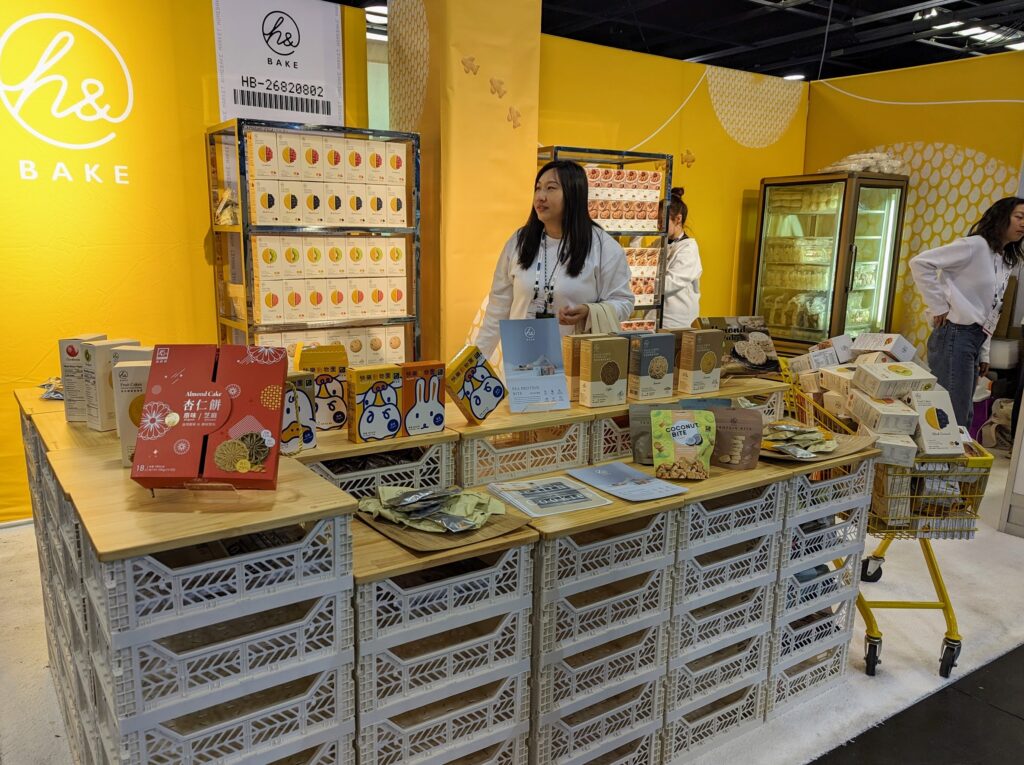
Taiwan-based snack manufacturer put its product on display cases made of shipping crates topped with wooden boards, anchoring its small space with a cool architectural element that caught attendees’ attention and didn’t cost much. With minimal messaging, the background graphics didn’t distract the shipping-crate display counter and offered a nice contrast to the packaging in taller display cases.
Amara
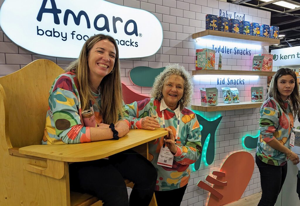
This tiny space by a baby and toddler snack manufacturer made up in energy and thoughtful elements every inch it lacked in footprint. Illuminated display shelves against a white faux finish came straight from an upscale kitchen of the brand’s customers. Staff members’ custom sweatshirts mimicked the package design and showed off supersized fruits and veggie ingredients, and a highchair fit for a grownup made for a fun conversation starter and a photo op.
Restomod Air
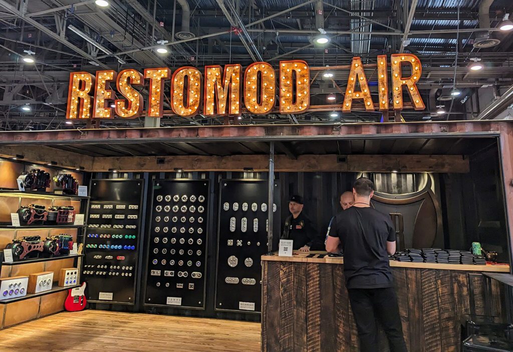
Restomod Air’s exhibit in a rusty shipping container framed with repurposed wood was all about bringing the old and the new together. Shiny controls and LED vent covers were artfully arranged on the black back wall while custom parts were displayed on the side shelves with built-in lights. The typography of the lighted sign played into the overall color scheme and the warm, rustic feel.
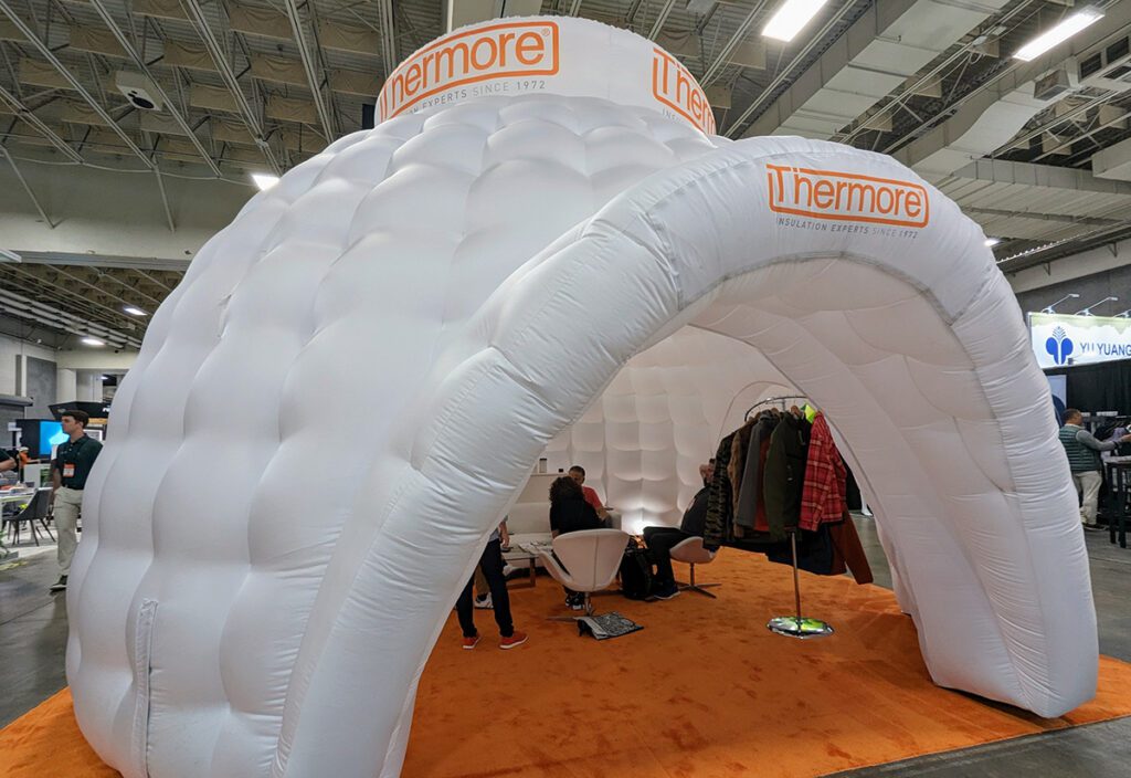
Thermore
It’s hard to miss a huge inflatable igloo. It also happened to be an excellent visual representation of the thermal insulation brand, bringing an element of unexpected creativity to the show floor. Inside, the warm glow made the space feel surprisingly cozy and inviting, unlike traditional walled-off exhibits, and enticing attendees’ creativity and providing a natural setting for trying on outerwear featuring the Italian brand’s products.
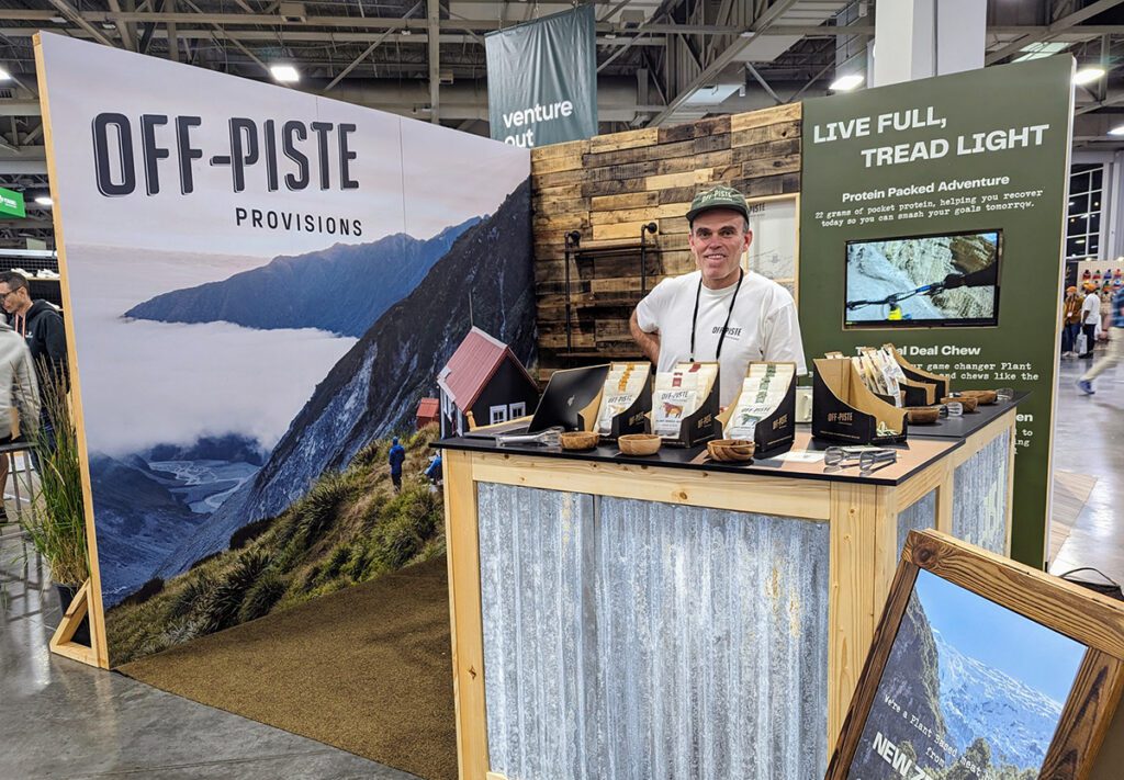
Off-Piste Provisions
The New Zealand producer of plant-based meat snacks packed a sense of adventure into a tiny booth that felt like a mountain cabin with magical views. From the driftwood backdrop to a corrugated metal countertop to a small display looping a biking video, the unassuming but well-thought-out elements created a cozy and inspiring space with serious. Kiwi vibes.
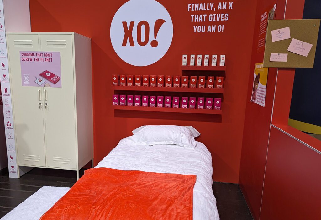
XO!
The vegan condoms brand made a bold statement with a bright-red space punctuated (OK, maybe not a great thing for a condom brand) by contrasting elements and graphics. No sophisticated digital touchpoints here—just a comfy bed and a cork board with upcoming activities in the booth. We really should comment on an X that gives you an O tagline, but hey, what do we know?
Featured Image: iStock/holgs


