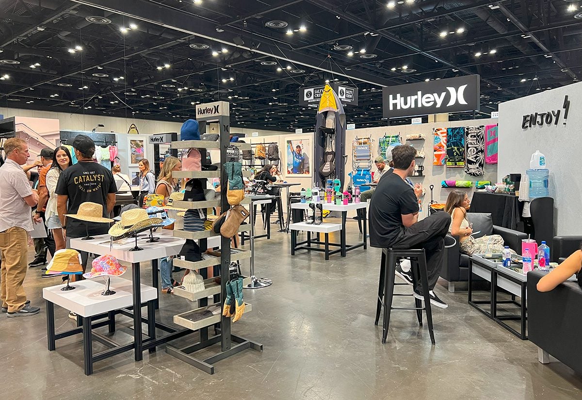
 We were stoked to attend our first Surf Expo, Sept. 5-7 at the Orange County Convention Center in Orlando, and the exhibitor community proved very friendly and welcoming, eager to show off their products and beach-inspired booths. From wetsuits to bucket hats to flip-flops, we explored the variety of exhibits that made up the largest and longest-running watersports, beach and resort lifestyle trade show, which is produced twice annually in September and January.
Surf Expo’s expansive show floor was divided into seven categories: surf, shoreline, swim, boutique, footwear, resort and coastal gift. While we mainly hit the surf, shoreline and swim areas, we noticed a lot of design and layout variation from booth to booth. Some opted for more of a classic storefront showroom with apparel and accessories displayed on metal racks and shelves, whereas others leaned into more of an outdoor environment brought onto the show floor with grassy carpets, sand-colored wood floors, greenery and lots of surfing imagery. Plus, several small-business owners we spoke to said they crafted the booth components themselves, from walls to signage to display cases, with help from friends, family and staffers.
Through our show floor traversing, we noticed five exhibit design and build trends that were unique to Surf Expo and the watersports audience. (For our full Surf Expo field report, click here.)
Breaking Down Pony Walls
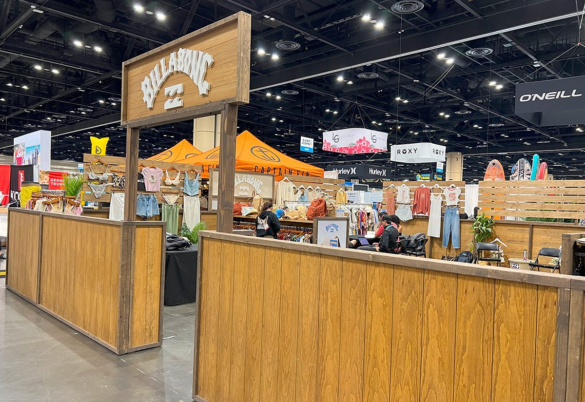
We turned down the first surf section aisle and noticed almost all of the booths in the area had half-height walls around the perimeter of their exhibits. Billabong’s pony walls sported a natural wood look with a logoed sign high above the booth’s opening. Inside, clothing racks lined the walls (not entirely visible to passersby unless they peeked over), and wooden planks attached to the top of the walls created extended backpack and apparel displays. Across the way, RVCA featured a similar wood-based build, but a completely different color scheme of gray, white and black gave it a more modern feel.
Captain Fin and Volcom, also across from each other, offered complementary booth designs, in which both of their exhibits’ pony walls were covered in art. The surfboard fin brand had a larger entrance opening than the others and featured comical cartoons of surfers and skateboarders on its walls, alongside photos of its team members crafting its products. Volcom, on the other hand, went for more of a graffiti art style, with skull, space and animal icons imbued with its signature diamond logo. This booth was fully enclosed, with mid-height saloon doors at the entrance.
MORE TRADE SHOW FLOOR COVERAGE:
- Top 10 Beachy Booth Builds that Made Waves at Surf Expo
- Field Report: Six Exhibit Trends from SuperZoo 2024
Coming Out of the Woodwork
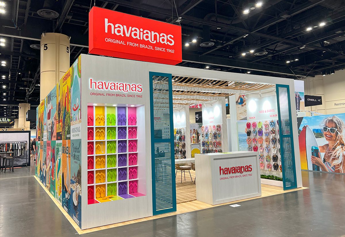
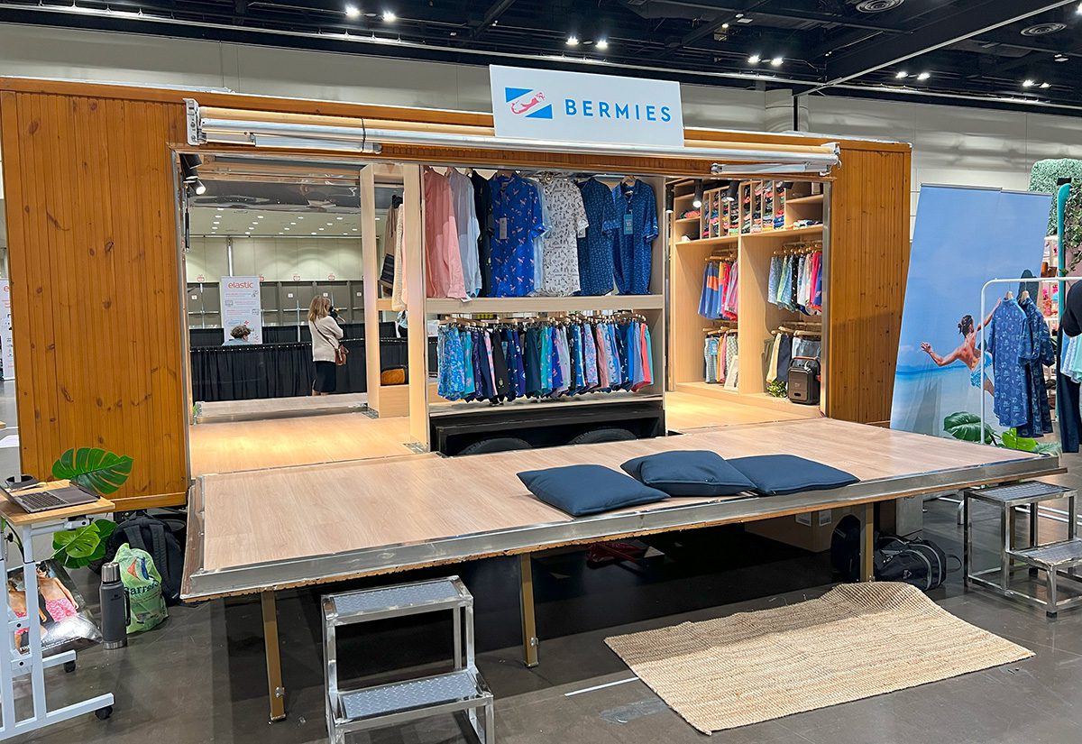
Wood was the predominant material used in booths across the Surf Expo show floor. Some exhibitors opted for a natural look, accented by greenery and potted plants, while others painted the wood to fit its brand color palette or create a themed environment. If the walls weren’t made of wood, then you could count on seeing at least wood beams overhead, wood slats embedded into walls and wood tables and seating, like at Havaianas’ flip-flop booth, which featured all of the above. Bermies brought a trailer showroom for its swim trunks onto the show floor that was completely wood paneled around the exterior, with the interior made up of light-colored wood flooring and shelving units, not to mention its portable wood desk for business dealings.
A Window into Booth Spaces
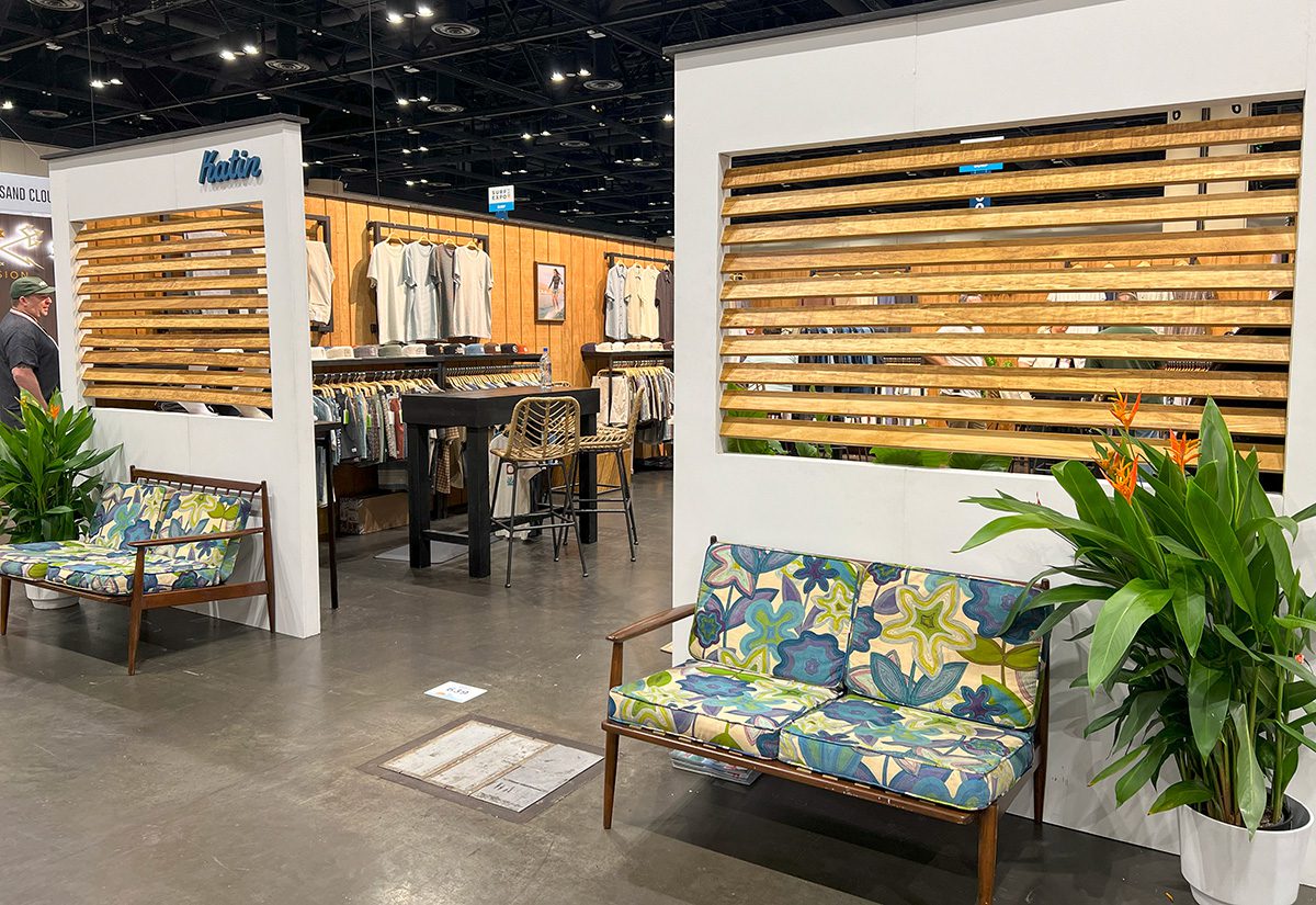
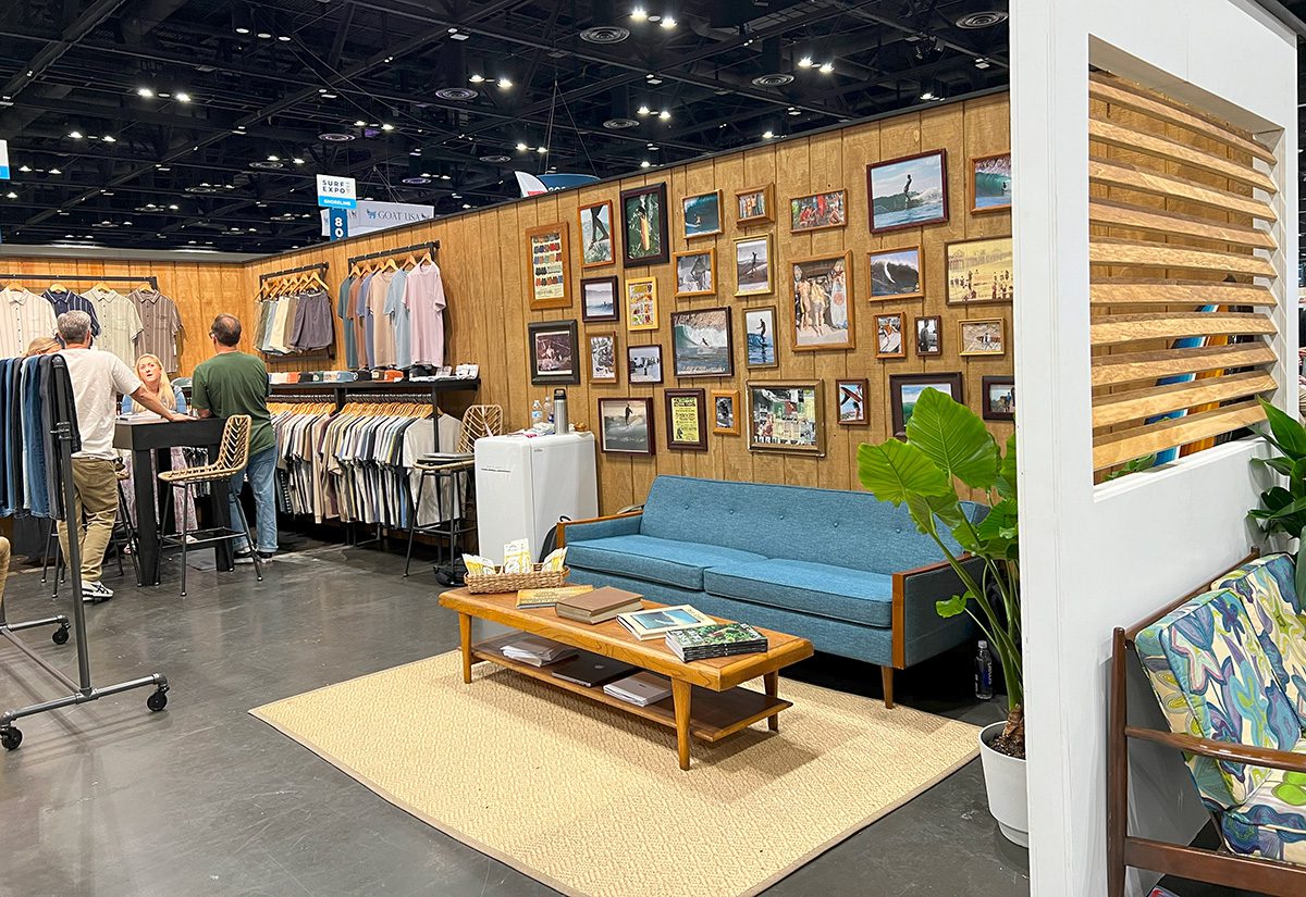
Enclosed booths with tall walls opened up their spaces with windows, specifically wood slat windows that gave passersby a preview of what was inside. They worked particularly well in exhibits designed to look like beach homes (Katin, for example) or resort destinations, elevating the exterior with a look of shutters, and exhibitors got creative with lighting around the windows to create shadows and patterns in the booths.
Innovative Clothing Racks and Displays
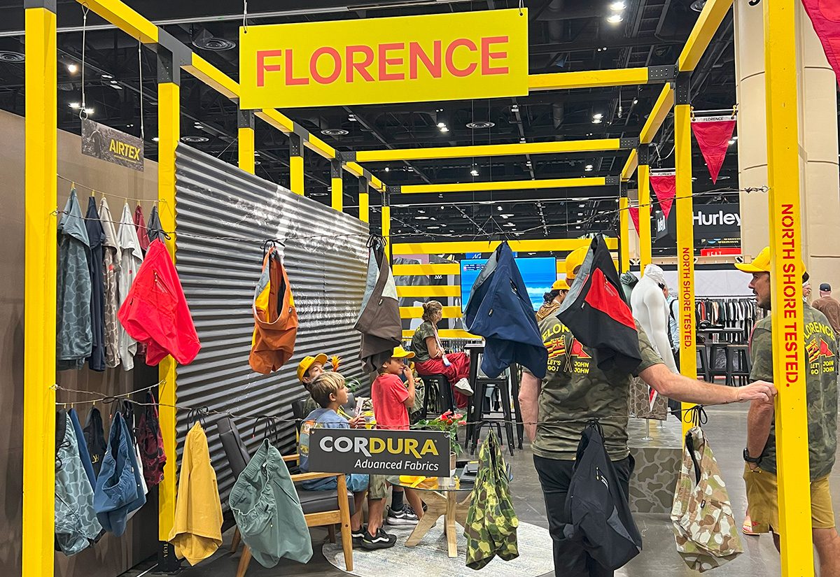
When most of the exhibitors on the floor are presenting some kind of apparel or accessory product, it can be hard to stand out. We saw a lot of the same rolling, single-rail metal clothing racks full of clothes on hangers, but a few brands found ways to display clothes in a unique way. Utilitarian gear brand Florence hung hoodies by their tags and tied shorts by their waist strings to stainless-steel clotheslines that went across its booth.
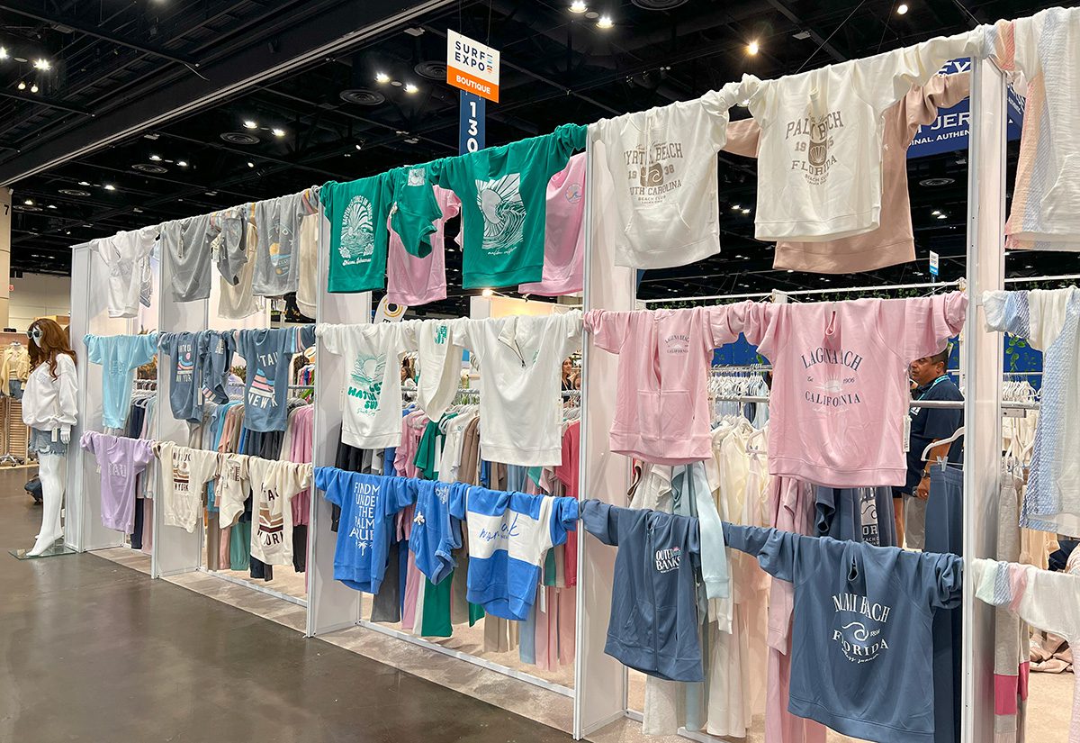
Boutique brand Vintage Havana used every inch of its booth space to display its women’s apparel collection. In addition to mannequins outside the entrance and traditional clothing racks extending around the booth’s edges, long-sleeve shirts, sweatshirts and shorts were strung across metal beams along the inside and outside of the footprint. The exterior wall’s three rows of clothes drew passersby into the pastel, boho booth.
Models Walking In-booth Runways
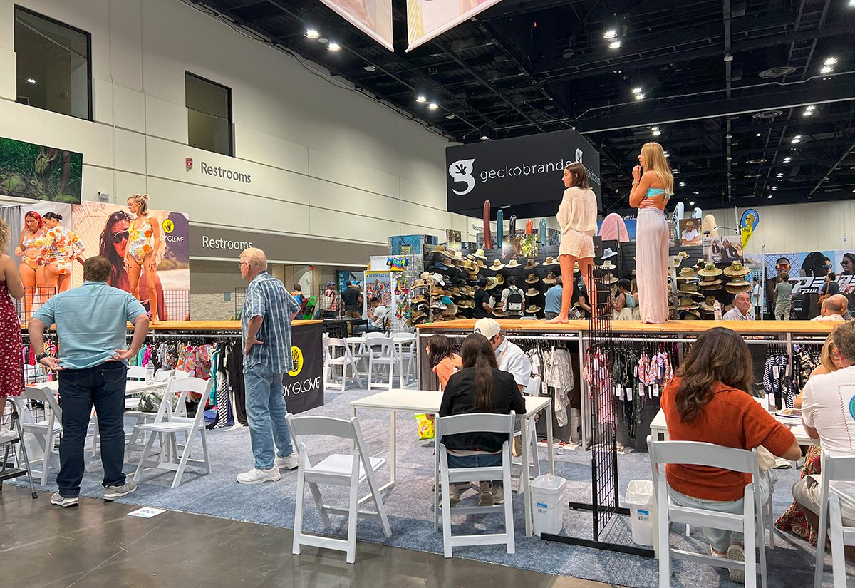
The show floor’s swim section featured two booths with models of different body types showing off swimsuits. In a co-branded space, Body Glove, Skye and Eldon took turns sending models down two raised, wooden surface runways that faced each other and had clothing racks underneath. Private changing areas behind very tall walls covered in photos of models at the beach were positioned at the back of the runways. Tables and chairs on both sides of the platforms allowed attendees to stop in to go through catalogs with brand reps.
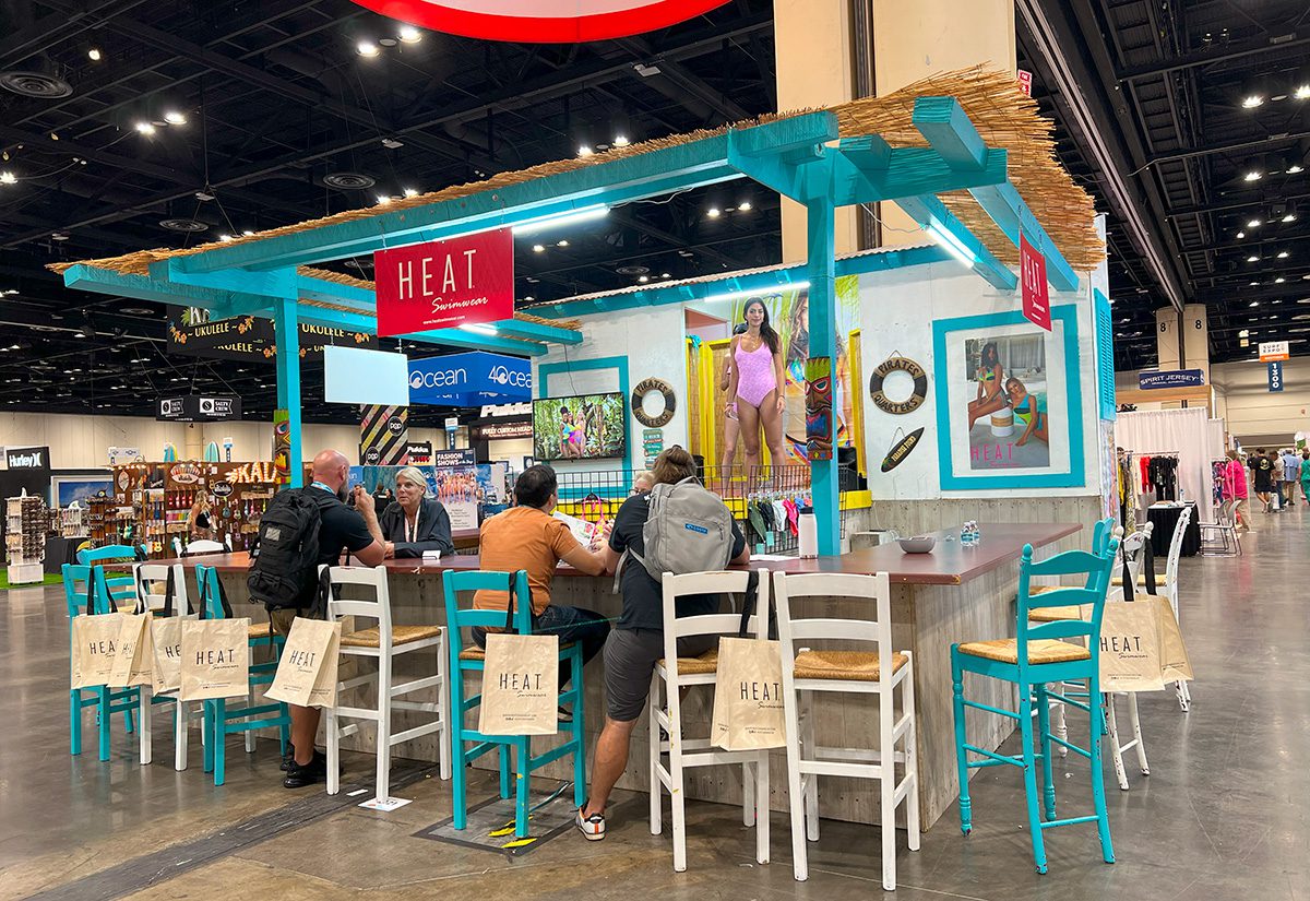
Heat Swimwear, which gave out branded tote bags around the convention center, popped up a colorful tiki bar-inspired booth with brand reps behind the bar, engaging with attendees who sat at the counter and perused product brochures like menus. At the center of the bar, where liquor would usually be displayed, was a mini elevated runway for models sporting the brand’s swimsuits to stand, pose and walk around.
