Team Summit is Dish Network’s annual expo that brings together a global network of partners, retailers and vendors (approximately 3,500 attendees) over three days in one space where the brand can showcase new Dish products, strategies and technology through training and general sessions. The approximately 45,000-square-foot space features different business units and anywhere between 13 to 20 different featured partners each year.
The show requires an efficient design strategy that allows Dish’s partners to present their individual marketing, but that overall maps back to their collaborations with Dish. This year, the team landed on the concept of the Smart City, a hub of interconnectivity, innovation and a way of connecting all these partners in this one Dish ecosystem.
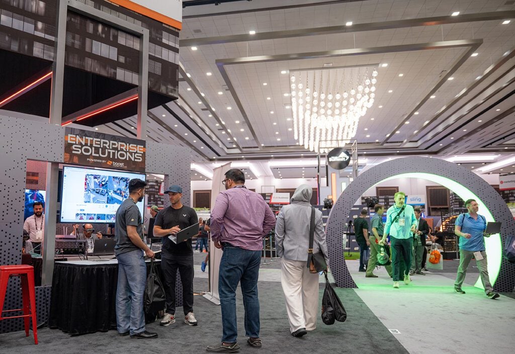
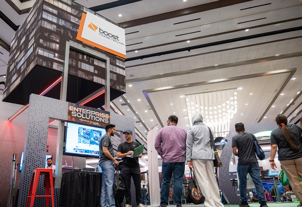
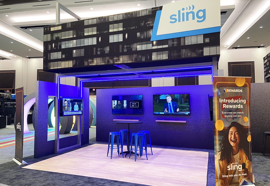
The spoke design featured five quadrants (five different business units) with walk-in structures (kits ranging from five-by-fives to 30-by-30s that the exhibitor-partners could take over. Each kit represented a thematic city build, like a hotel, apartments, and even a local bar. At the center was a city park area featuring a stage for presentations. And while there was a consistent look and feel throughout, each exhibitor could decide the features they wanted inside of their booth. The booths were constructed with aluminum framing that helped the team meet its budget, while overhead signage and canopies drove home that city skyline feel (Partner: ASV).
Let’s look at three features of the Smart City footprint from the show at the Caesars Forum in Las Vegas.
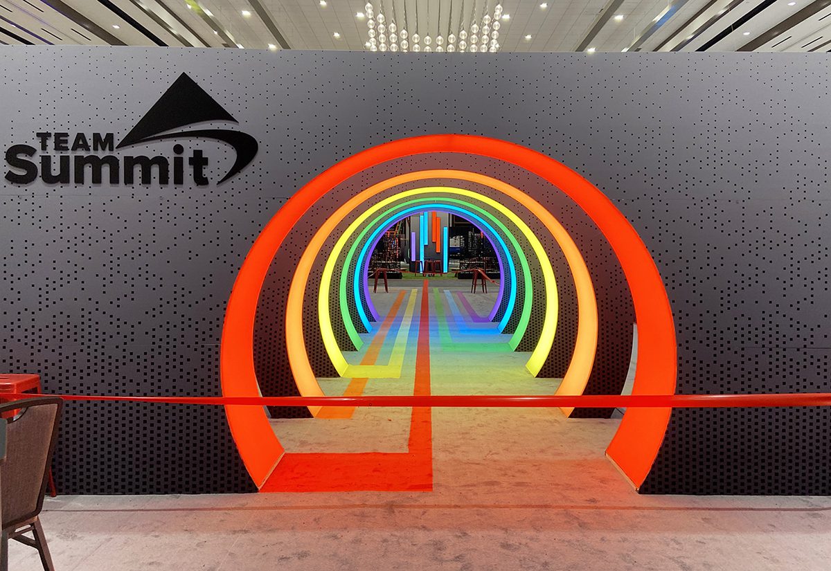
LED Wayfinding
Each quadrant within the Smart City had a circular LED ring that acted as a visual gateway into that zone. LED tracking that began at the entrance led attendees to these illuminated portals and into that particular quadrant of interest. For example, the red LED strip and lighting led to the Dish corporate zone, orange led to Boost Mobile, and blue led to Sling TV. Carpet inlays were also colorized within each zone to further to drive home the business unit and theme.
A Central Meeting Point
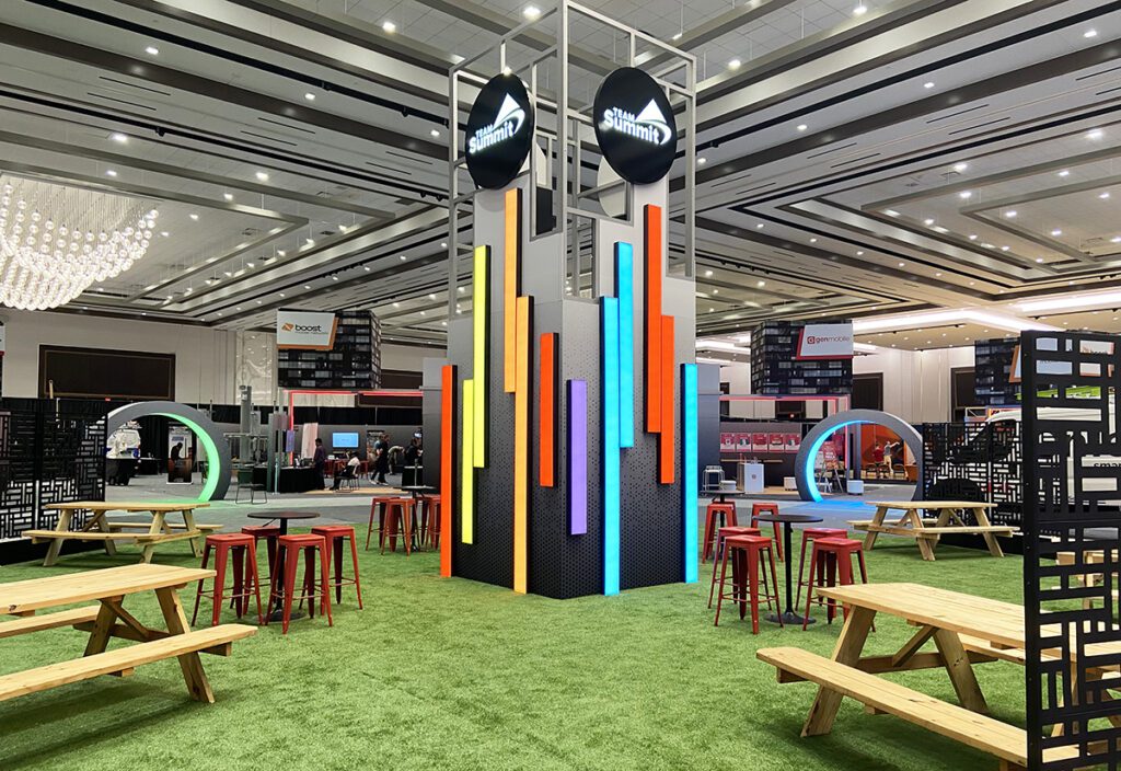
At the center of the spoke design was a city center featuring a 16-foot-high metal aluminum tower with illuminated Dish Team Summit beacons on top. This central area served as a space for informal meetings, for food and beverage, executive meet-and-greets and other activities.
Entertainment
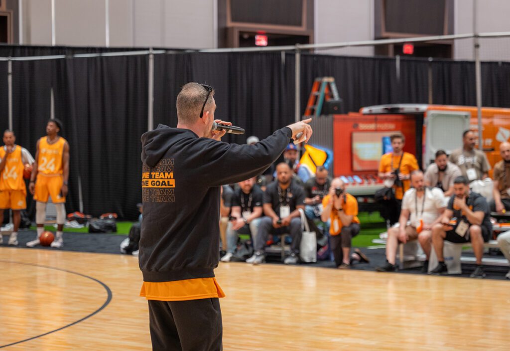
One of the distinguishing elements of the design was a half-court basketball area for Boost as well as two football zones. Boost brought in some of their sponsored players, and hosted tournaments and other games throughout the show, in addition to meet and greets and autographic signing.
Bonus Insight: All About the Specs
The Dish Smart City design featured 16 walk-in structures (kits), more than 11,000 square feet of SEG graphics, 60 hard panel signs, 11 Illuminated portals, and 1,200 linear feet of LED rope lighting.
Photo Credit: ASV

